
PROJECT
BRAND DEVELOPMENT
EXHIBITION & CONVENTION SIGNAGE
SOCIAL MEDIA MARKETING
PRINT | DIGITAL | OOH MARKETING
PHOTO/VIDEO ART DIRECTION
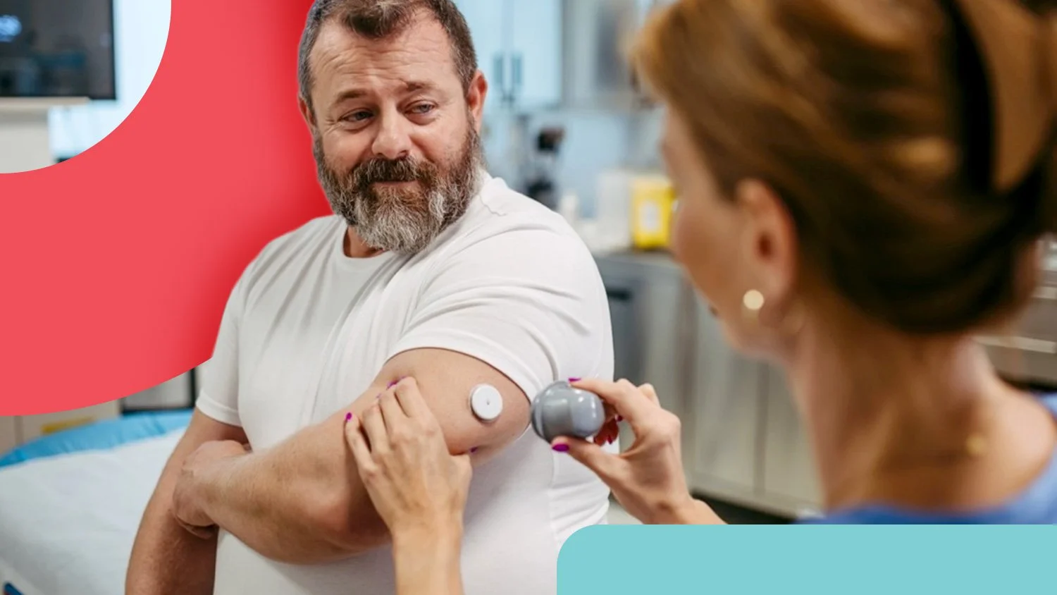
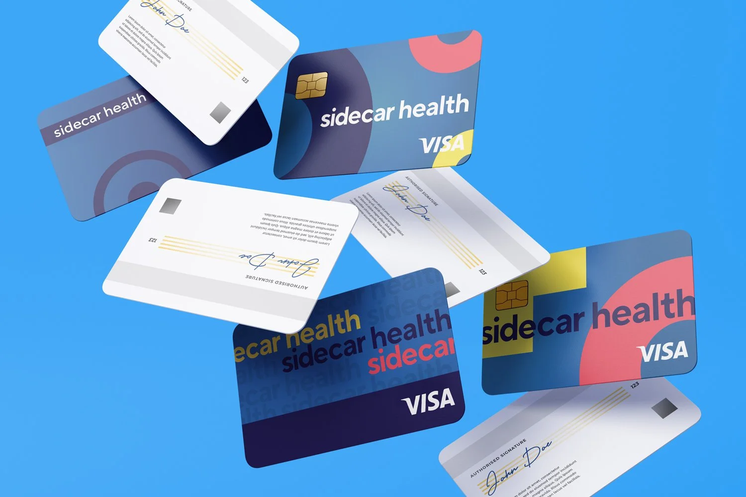
In a category where most brands default to safe, clinical, and forgettable, Sidecar Health takes a deliberately different approach. Instead of blending into a sea of blue logos and sterile messaging, the brand leans into bold color, warmth, and clarity to reflect a fundamentally new way of thinking about healthcare. Built around giving people transparency, choice, and control over their care, the experience is designed to feel empowering rather than overwhelming, extending all the way to how care is paid for. With the Sidecar Health Visa card, members can pay for care directly, removing the typical confusion of claims and reimbursements and making the process feel simple and immediate. The visual system mirrors that philosophy, using vibrant palettes, approachable typography, and human-centered storytelling to make complex healthcare concepts easier to understand. By pairing a modern, flexible design system with a tone that feels optimistic and direct, the brand challenges expectations and redefines what a healthcare company can look and feel like.
COMPLETE TRANSFORMATION
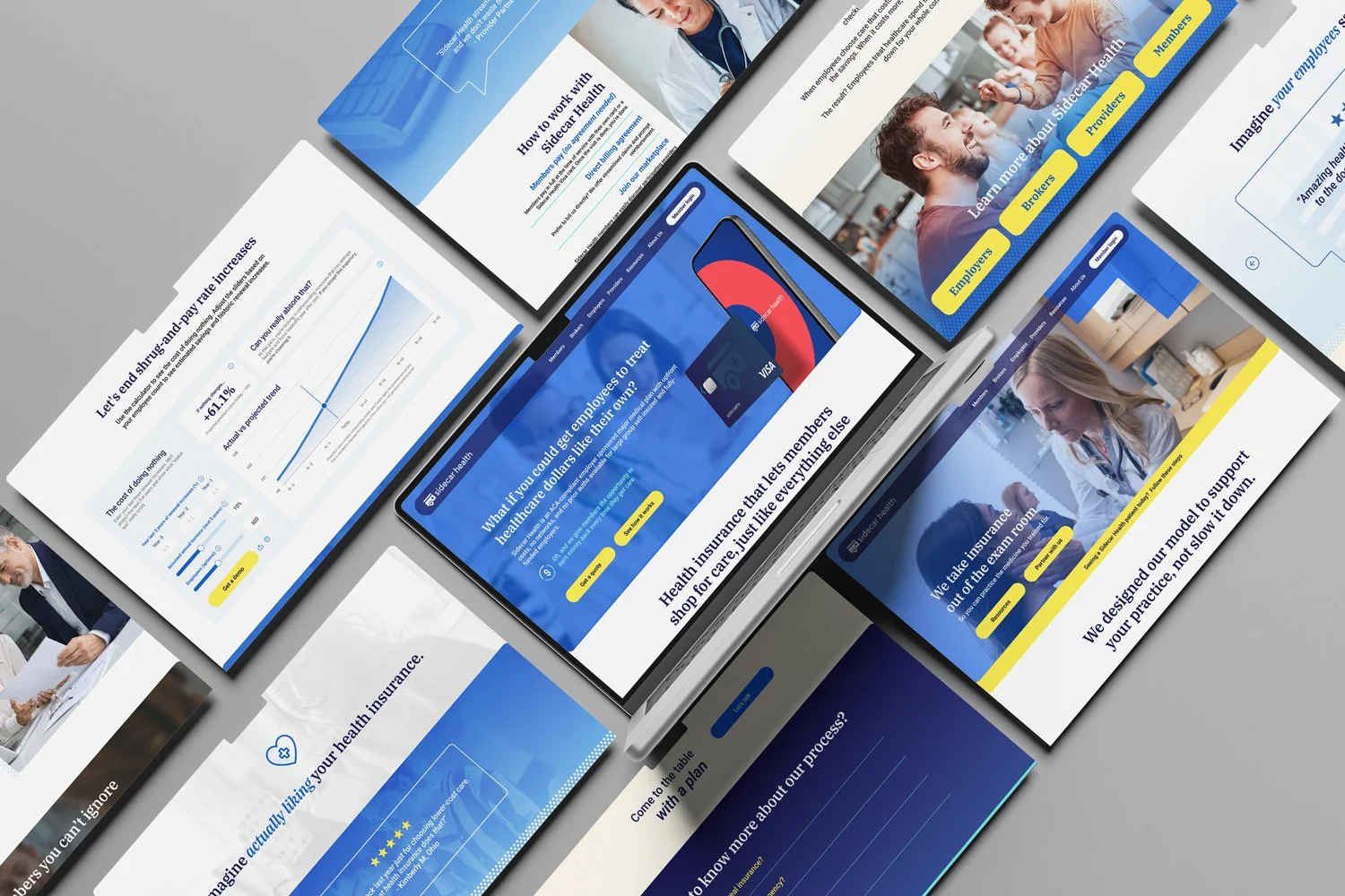
With the foundational brand elements in place, the next step was to rebuild the entire experience from the ground up, starting with the website. Over time, the existing site had grown stale, weighed down by outdated patterns and a structure that no longer reflected the simplicity and transparency at the core of Sidecar Health. It was in desperate need of a kick in the deductible. The redesign focused on stripping away friction, clarifying the story, and creating a more intuitive, engaging experience that could better guide people through how the product works. A system of custom display icons was introduced throughout the site, giving complex ideas a clear, visual shorthand while reinforcing the brand’s personality. Paired with bold color, concise messaging, and thoughtful interactions, these elements transformed the site into a true extension of the brand, one that feels as modern, approachable, and empowering as the healthcare experience it represents.
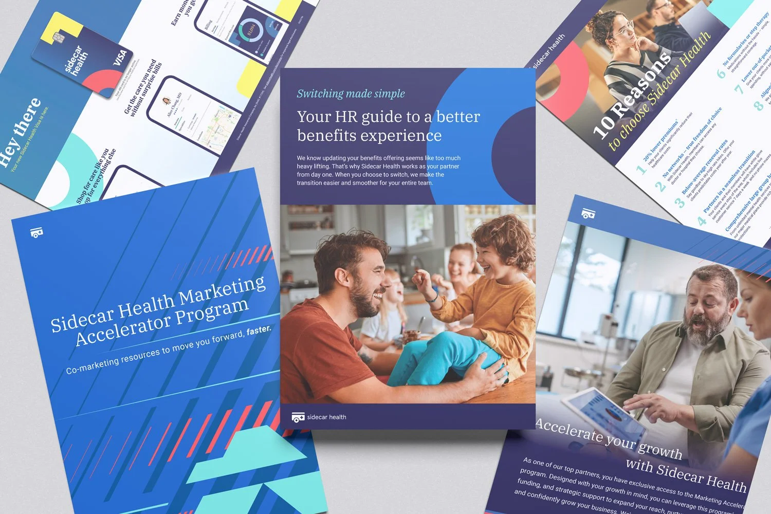
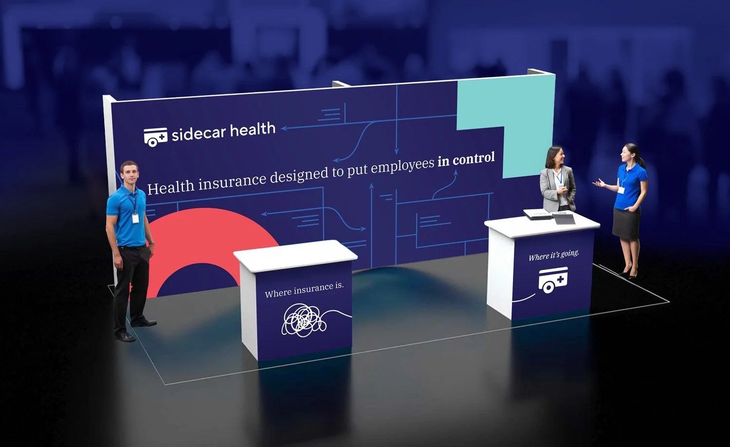
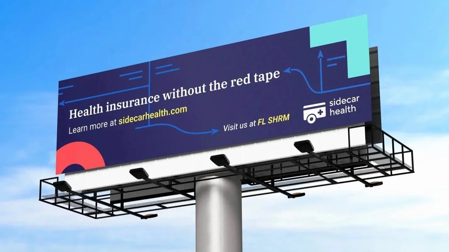
With the visual direction firmly established, the focus shifted to bringing the brand to life across every physical touchpoint. From print materials of all sizes to bold out-of-home executions, each piece was designed to carry the same energy, clarity, and warmth into the real world. The goal was not just consistency, but presence. At conferences and events, Sidecar Health showed up in a way that was impossible to ignore, using vibrant color, confident messaging, and thoughtfully designed environments to stand apart from the expected sea of muted healthcare booths. Every detail worked together to create a cohesive, memorable experience that reinforced the brand’s mission while proving that healthcare can, in fact, be both informative and visually compelling.
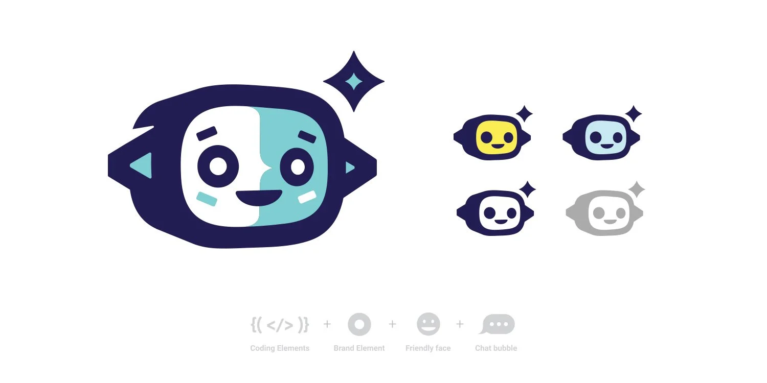
PUTTING A FACE TO A NAME
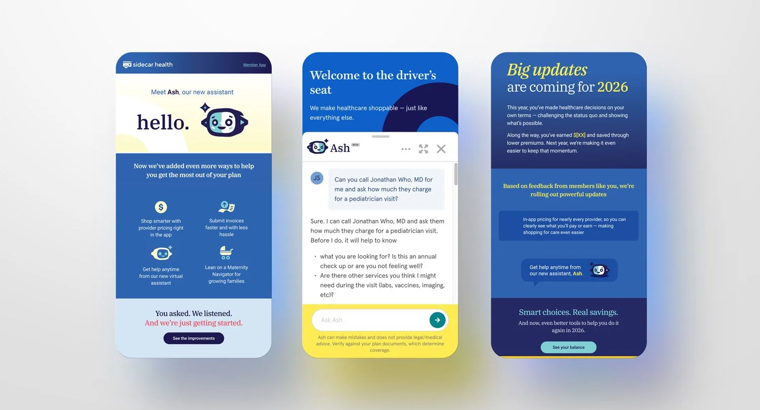
As the experience evolved within the product, a new opportunity emerged to give the technology a more human touch through the creation of a custom AI agent. The result was ASH(Ask Sidecar Health), a distinct visual character designed to feel intelligent, approachable, and endlessly curious. Drawing from programming symbols, core brand elements, and a sense of wide-eyed exploration, the face of ASH was crafted to embody guidance without intimidation. Beyond the character itself, a supporting system of icons was developed to create a visual vocabulary that works in tandem with ASH, helping translate complex information into simple, intuitive cues. Together, these elements allow Sidecar Health to guide users more clearly to the care they need, reinforcing a product experience that feels both smart and genuinely helpful.
What began as a challenge to rethink how a healthcare brand shows up evolved into a complete reimagining of how it looks, feels, and functions across every touchpoint. From a bold, human-centered identity to a fully rebuilt digital experience, from expressive physical applications to an intelligent in-product guide, each piece works together to support a clearer, more empowering way to navigate care. The work proves that healthcare does not have to feel cold or confusing. It can be transparent, intuitive, and even engaging. By aligning brand, product, and experience into a cohesive system, Sidecar Health sets a new standard for what modern healthcare can be, and creates a foundation designed to evolve alongside the people it serves.